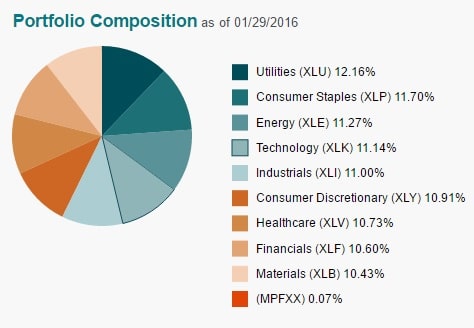
Fund company ALPS has an interesting ETF available: ALPS Equal Sector Weight, symbol EQL. You can see the ETF’s portfolio breakdown below:

For comparison’s sake, here is how the S&P 500 (SPY) composition looks by sector:

Clearly, there will be large discrepancies with a 12% allocation to utilities vs only 3.28% for the S&P 500. Conversely, you might expect it to suffer by not having as much allocated to recently hot sectors such as healthcare and technology.
Let’s see how the performance has shaken out thus far:
The inception on the fund is 7/2/09, since when it has returned about 14.17% a year (with dividends reinvested), lagging the market-cap weighted S&P 500 (SPY) by about 50 basis points a year. The risk-reward profile hasn’t been that great to justify the higher expense ratio (.30% vs SPY’s .09%):

However, I wanted to see if I could duplicate the idea and stretch it back a bit further to see how the results would look beyond just what has been a bull market since the middle of 2009.
Using equal weightings to the various Sector Select SPDR ETFs (XLF, XLV, XLI, XLY, XLP, XLB, XLK, XLU, XLE), and data for these ETFs go back to 12/16/1998. Plugging that into Morningstar, and reinvesting dividends with annual rebalancing, the results were surprising:
The equal-weighted approach by sector actually crushed the market-cap weighted S&P 500: 6.36% annually vs the SPY’s 4.9% annual gain.
During the tech crash bear market from March 2000 till October 2002, the equal-sector weight portfolio suffered about 67% of the drawdown the S&P 500 experienced:

However, during the most recent bear market from ’07 until ’09, the equal-sector weight portfolio performed only marginally better:

This is not surprising, given that the 2000-2002 bear market was not evenly felt by all sectors, whereas everything was just about annihilated equally in the bear market that coincided with the financial crisis.
Here’s how the sector equal-weight strategy looks compared to the S&P 500 when considering risk/reward, etc:

As you can tell, there is less volatility in the sector equal-weight strategy, but it doesn’t result in a higher Sharpe Ratio until you extend it out ten years.
While I think there is some merit to weighting the sectors equally in order to have more upside potential from high-yielding sectors such as utilities during a year such as 2014 when rates fell, and also to allocate more into energy to benefit from its inevitable rebound, I’m not completely sold that the added expenses and complications with managing such a strategy would be outweighed by the potential extra return, given that the two major cycles we’ve experienced since 2000 were uneven, and thus difficult from which to draw conclusions.
(All data from Morningstar.)

