Anthony Davidow of Charles Schwab has an interesting white paper on how country and company selection matter to emerging market investing. Writes Mr. Davidow:
“Although emerging markets represent countries that are growing and may indeed become developed markets in the future, they are often at different stages of development. Their growth is affected by a number of factors, including geopolitical risk, import/export balance, natural resource access and exposure, demographics, and environmental factors, among others. While countries and economies are loosely grouped together as emerging markets, the economic growth and investment returns of the markets vary greatly from year to year.”
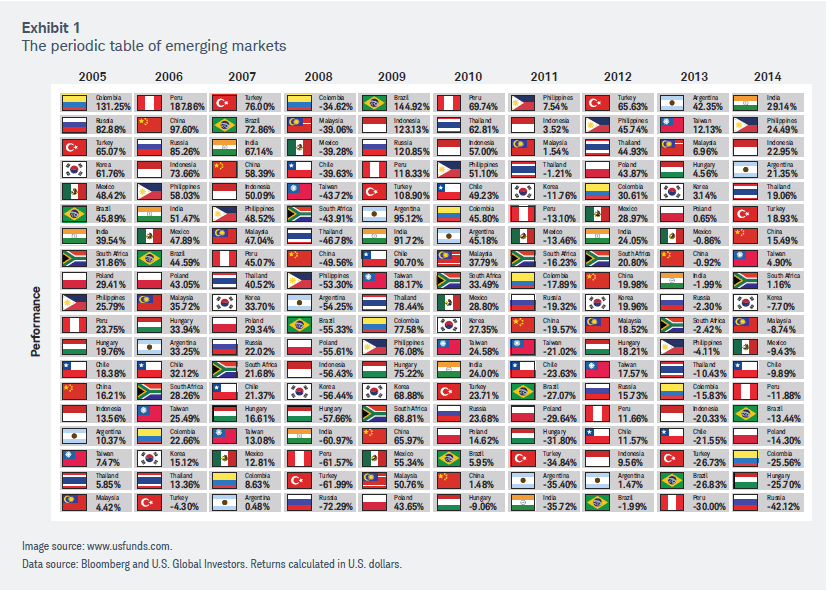
You can see from the table below (from Mr. Davidow’s paper) just how varied the returns have been from country to country:

I decided to run the numbers to see just how each country in the table above performed over the period shown. The results were very surprising:

Given these results, I wondered why the MSCI Emerging Markets Index returned only about 8.78% annually over the same timeframe. I believe it has everything to do with composition and weighting. For example, weighting by market cap (as for example the popular iShares MSCI Emering Markets ETF, symbol EEM, does), gives you increased exposure to state-run companies. This can have a drag on performance because, as Todd Shriber of ETFTrends.com wrote last year:
“There are times when state-run companies disappoint investors. Six such firms combining for over 6% of EEM’s weight are found among that ETF’s top-10 holdings.”
Another disadvantage to weighting by market cap is that investors are underexposed to investments in smaller, yet perhaps better performing countries. Of the top four performers from 2005-2014, – the Philippines, Indonesia, Peru, and Thailand, – only Thailand has a weighting greater than 2% in EEM (as of 3/3/16). In DFA’s Emering Markets Portfolio (symbol DFEMX), the same is also true; Thailand accounts for 2.76%, while the Philippines register just 1.97% (as of 12/31/15).
With that being said, I wanted to run the numbers (using the country returns in the table above) to see how an equal-weight approach (rebalanced annually) would fare versus the more conventional EM portfolios. The results are as follows:

Obviously, equal-weighting trounced the competition from 2005-2014.
However, it is a legitimate question to ask whether this is too small a sample size, and also why did I stop at 2014? The answer to the second question is that that is the only time period for which I had country-specific returns. As for it being too small a sample size, I happen to think 10 years covers a lot of different cycles, both economically and in commodities, to which most EMs are heavily correlated.
That being said, with help from my buddy Jake (@EconomPic), I was able to get return data for an equal-weight EM index I didn’t even know existed (MSCI’s Equal Country Weighted Index) to compare its performance versus MSCI’s major EM index. From the index’s inception in January 1999 through 2/29/16, the equal-weighted approach outperformed fairly dramatically:

One caveat I would say is that MSCI’s equal-weight index does not have the same composition as the countries outlined in the tables above. However, it is reasonable to expect it to be a fair approximation. The returns were not altogether that different.
The second caveat might be that an equal-weight EM index might be difficult to implement for an average investor. That is not necessarily the case anymore as there are country ETFs available for just about any country, emerging or developed, in which an individual might wish to invest. I cannot say, however, whether these country ETFs are accurate representatives of their home country’s stock market performance.
Perhaps the easiest way for an investor to equal-weight his or her emerging market exposure would be to invest in Guggenheim’s MSCI Emerging Markets Equal Country Weight ETF, symbol EWEM. As its name implies, it is designed to track the performance of MSCI’s Equal Country Weight Index. It is only a bit more expensive (.80% net expense ratio) than EEM’s .69% or DFEMX’s .57%. Such a slight increase in expense is surely justified given a much more balanced portfolio (left) versus EEM (right):

As a postscript, I can’t say why Guggenheim’s site is showing 7.52% of assets in the US. Here’s Morningstar’s regional breakdown of EWEM:


